Published on March 2, 2020.
Over the past few months, I’ve been working on the first version of a donor advising tool for the masses, working with the team at The Next 50. The idea is simple: most people want to donate to progressive causes and candidates, but don’t know where to best spend their money. We set out to solve this problem by creating a database of causes and candidates with all of the metadata needed to make personalized recommendations and building a webapp that lets users navigate the list by answering a few multiple-choice questions.
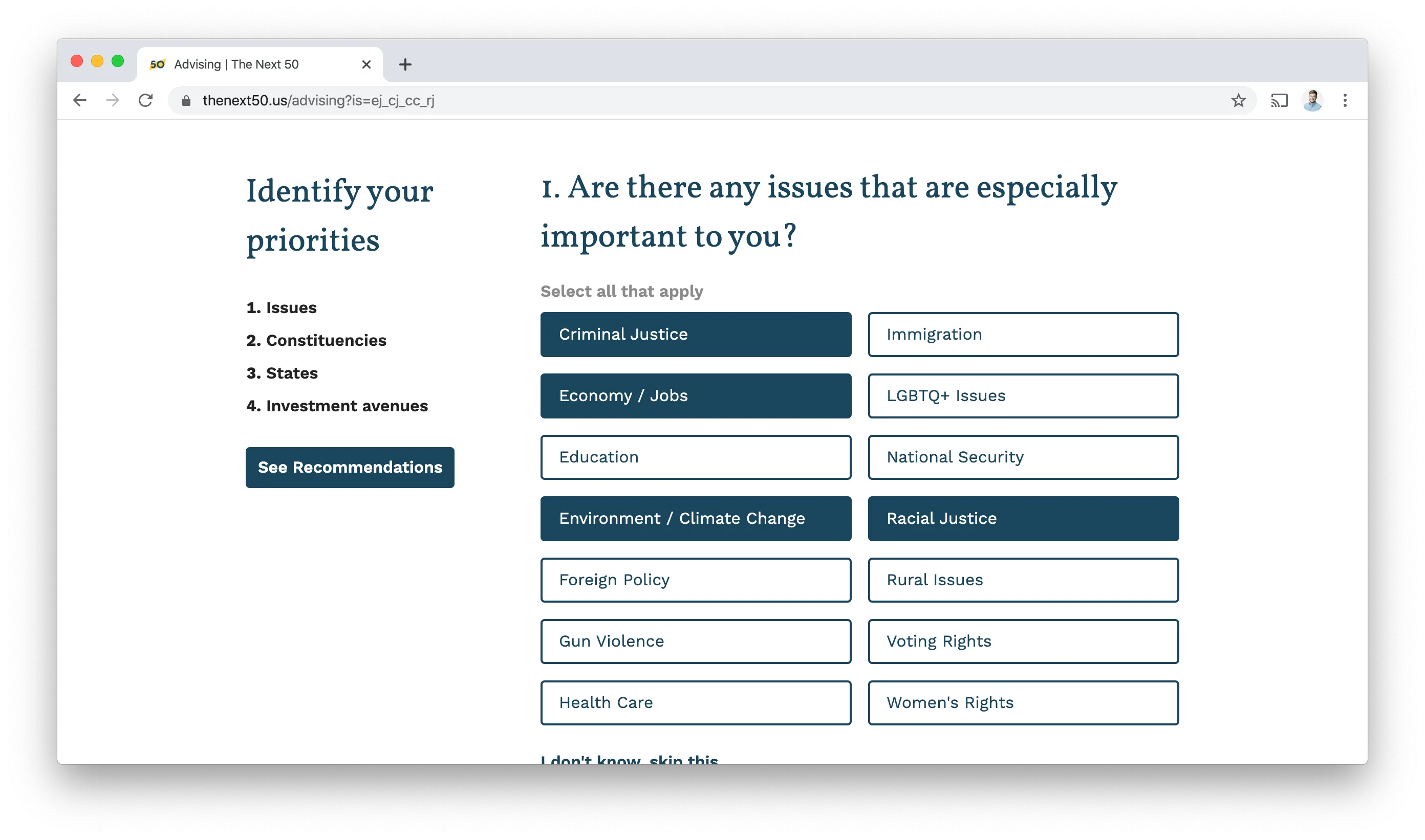
In the first version, we ask visitors just four questions:
- Are there any issues that are especially important to you?
- Are there any constituencies that are especially important to you?
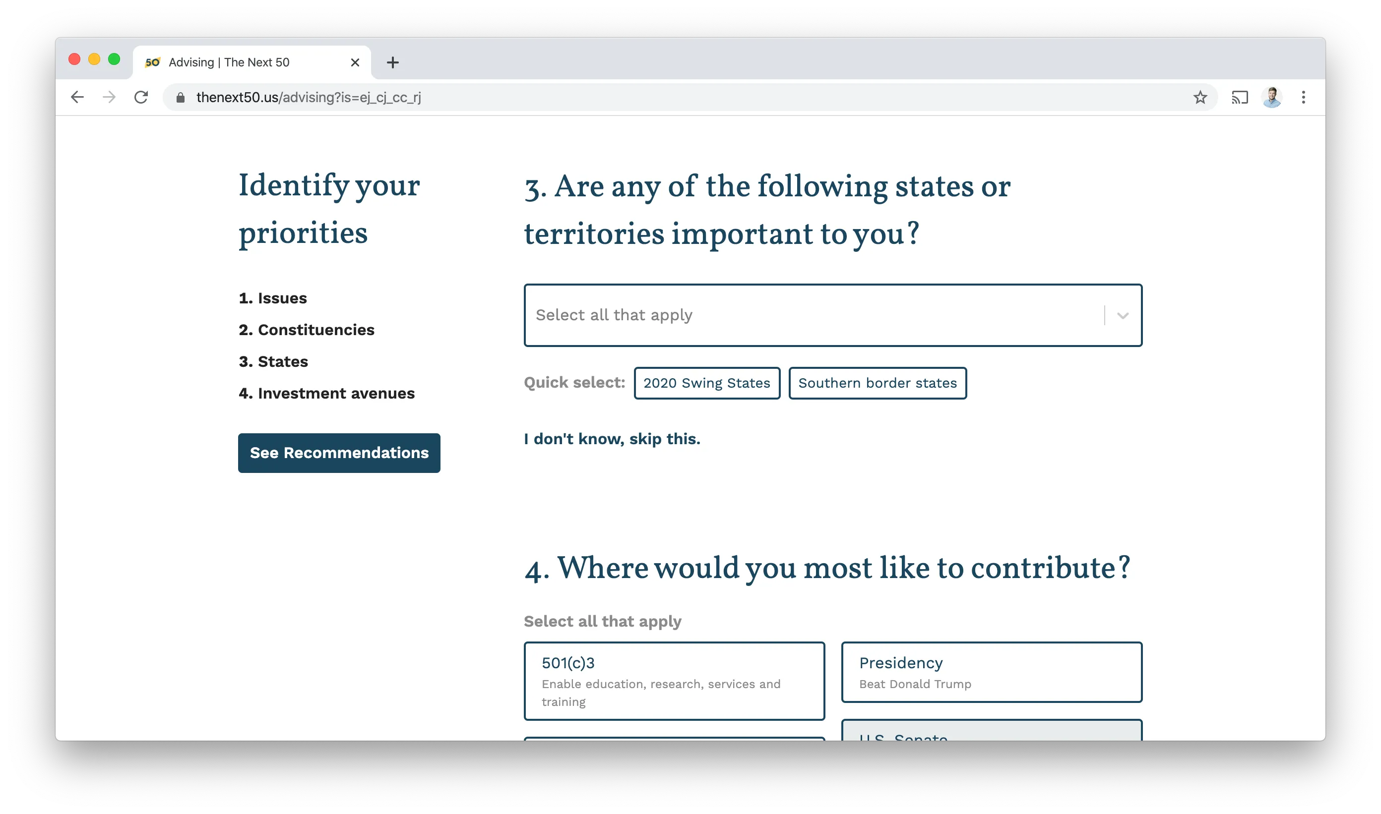
- Are any of the following states or territories important to you?
- Where would you most like to contribute?
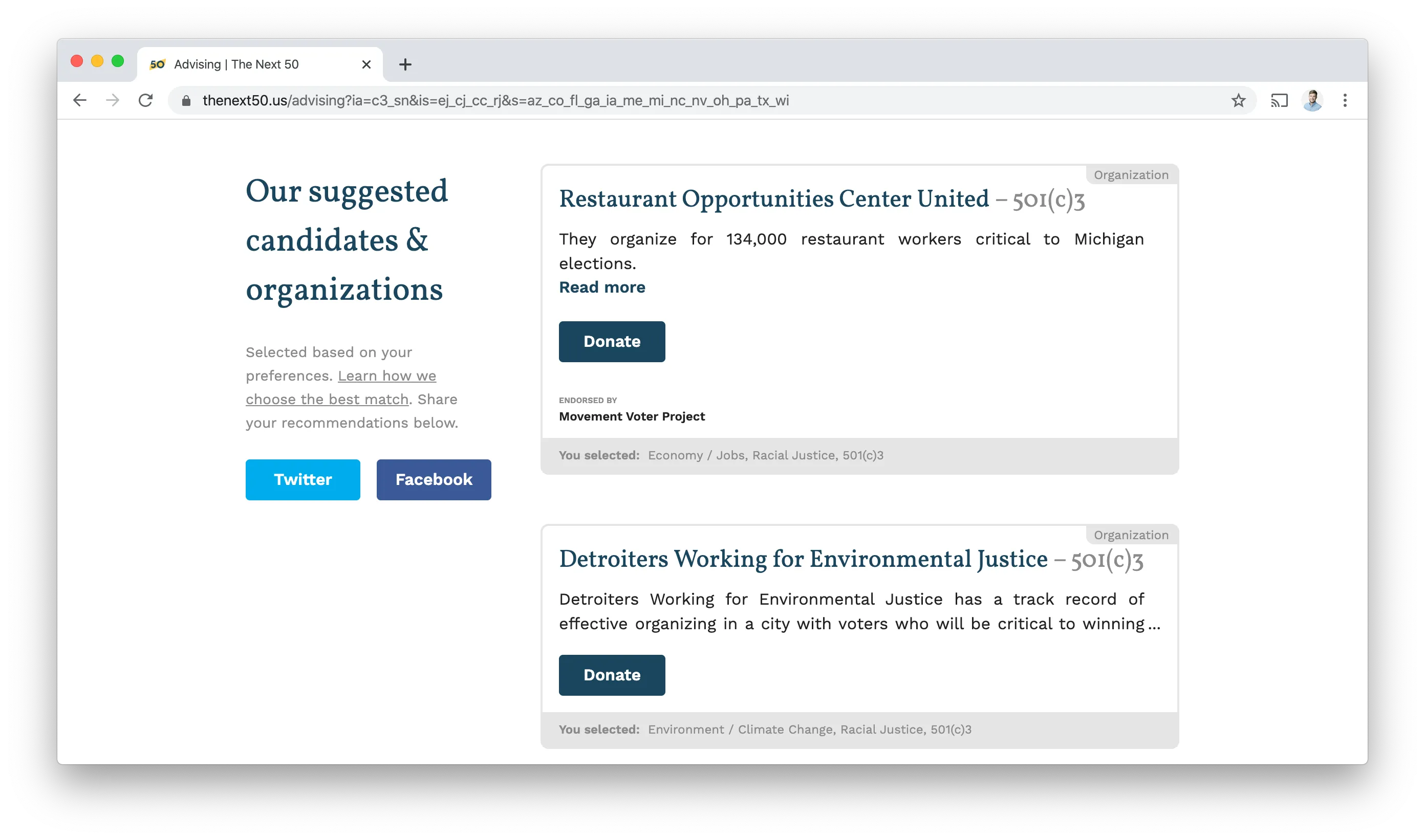
With this information in hand, we rank and suggest six candidates and organizations that best match the user’s donation preferences. For each suggestion, we share background context on who they are and what they work towards, endorsements they’ve received, and what criteria we used to suggest the match.
There were some tricky UX issues to tackle in the project. For example, multi-selecting states of interest from a dropdown is tedious. To make the 80% case easier, we added quick-select suggestions for 2020 swing states and southern border states.
This project was a great opportunity to push the limits of the Google Sheets & Firebase backend that we were using on the rest of our website. The app frontend is built with React and Redux.
The basic dataflow involved using firebaseConnect from react-redux-firebase to pull the full list of candidates and organizations into the React props. Then, after scoring the candidates and organizations (based on the user’s questions), they’re merged, sorted, and rendered.
const enhance = compose(
  firebaseConnect((props) => [
    { path: 'organizations' },
    { path: 'candidates' },
  ]),
  connect(({ firebase }) => ({
    rawOrganizations: firebase.data['organizations'],
    rawCandidates: firebase.data['candidates'],
  }))
);

class SuggestionList extends Component {
  scoreSuggestions(suggestions) { /* ... */ }
  suggestionsSort(a, b) { /* ... */ }
  /* ... */
  render() {
    const { rawCandidates, rawOrganizations } = this.props;
    const scoredCandidates = this.scoreSuggestions(rawCandidates);
    const scoredOrganizations = this.scoreSuggestions(rawOrganizations);
    const mixedList = [].concat(scoredCandidates, scoredOrganizations);
    const sortedList = mixedList.sort(this.suggestionsSort).slice(0, 6);
    return (
      /* ... */
      {sortedList.map(({score, suggestion}) => {
        if (suggestion instanceof Candidate) {
          return (<CandidateCard candidate={suggestion}/>);
        } else {
          return (<OrganizationCard organization={suggestion} />);
        }
      })}
      /* ... */
    );
  }
}

export default enhance(SuggestionList);
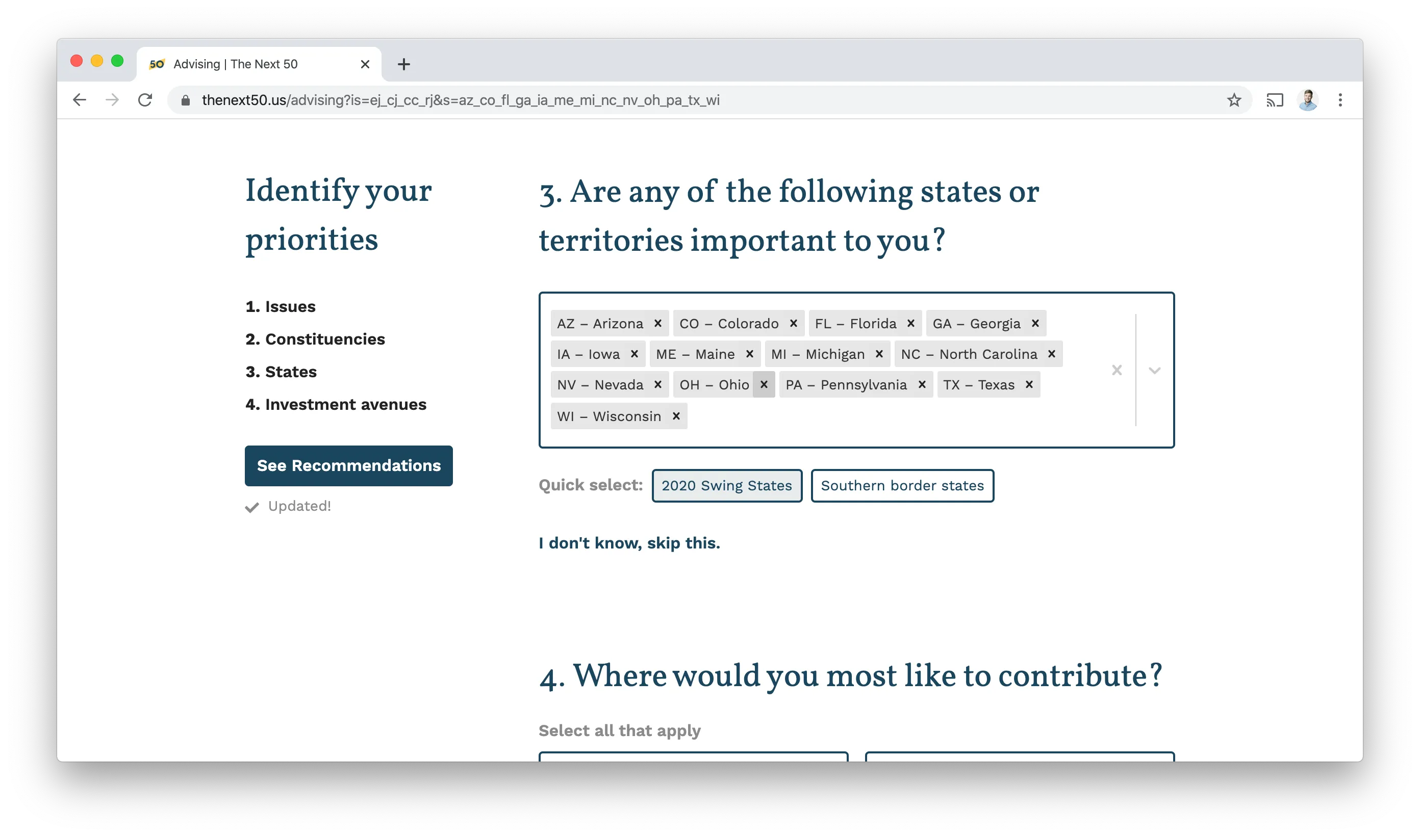
One of the early features we felt strongly about was the ability to share recommendations to Facebook or Twitter. To make this work, we needed unique URLs for each user’s combination of responses. To achieve this I wrote two functions: responsesToQueryString and queryStringToResponses, and then hooked them up to componentWillMount and componentWillUpdate so that the query parameters always match the user’s question responses.
import {
  responsesToQueryString,
  queryStringToResponses
} from '../utils/QueryStringUtils';

class Advising extends Component {
  componentWillMount() {
    const { history, location, setInitialResponses } = this.props;
    const responses = queryStringToResponses(location.search)
    setInitialResponses(responses);
  }

  componentDidUpdate(prevProps) {
    const { history, location, responses } = this.props;
    const query = responsesToQueryString(responses)
    if (query !== location.search.replace(/^\?/,"")) {
      history.replace(`/advising?${ query }`);
    }
  }
  /* ... */
}
You can see the results in the URL bar below. Clicking the Facebook / Twitter share buttons will share the current URL.

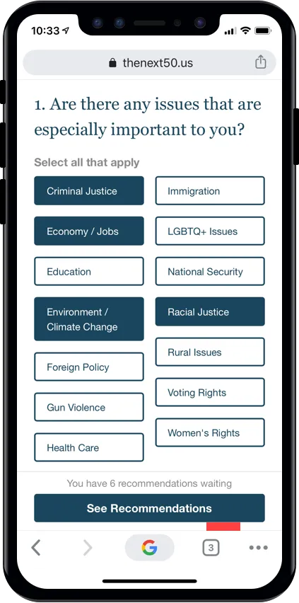
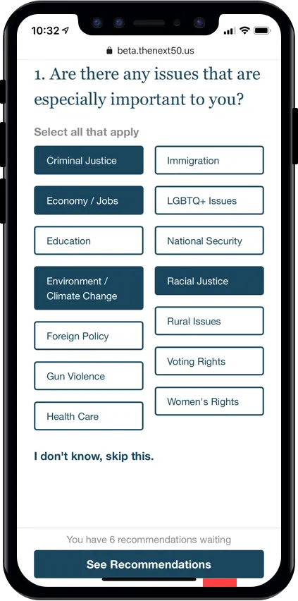
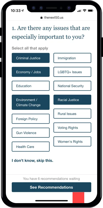
As we were doing QA testing before rollout, I pulled up the site on an iPhone X, and noticed a tricky issue. The bottom bar that lets users skip to the recommendations looked fine initally, but looked broken if a user scrolled the page and collapsed the browser navigation. This is because on iOS, the renderable canvas of the browser extends underneath the thin black home indicator. Without being able to detect the presence of the browser navigation on these devices, I’d have to pick a padding value that looked good with the navigation collapsed and expanded. Bummer!
But, in a moment of optimism, I thought, might there be a mechanism in the web platform to automatically adjust for cases like this? In fact, there was! It turns out, there is a CSS function env that can be used to select the size of the non-rectangular area in a screen. Amazing! What I needed here was env(safe-area-inset-bottom). I applied this code with a fallback:
.bottom-bar {
    /* ... */
    padding: 0.25rem 1.5rem 0.75rem;
    padding-bottom: calc(0.75rem + env(safe-area-inset-bottom));
}
And the results were fantastic! Chrome (or Safari) on iOS adjust the value of this variable depending on the navigation state, making this essentially a one-line fix. What a relief!
I’m really happy with how the tool turned out. With just a few questions, you can get meaningful personalized recommendatios for where would be best to allocate donations to progressive candidate and causes. Give it a try, and if you make a donation, let me know by tweet or email!
